Residential segregation based on taxable income in the metropolitan area of Athens
Pantazis Panayotis|Psycharis Yannis
Social Structure
2016 | Jan
Conceptual approaches to income segregation
Income is a defining factor for the selection of a place of residence, while housing costs are strictly connected to the cost of neighbouring houses. Real estate agents, appraisers and buyers use the latest prices of comparable real estate in local housing markets to assess prices. In parallel, since mortgages are linked to income, the choices of residents are defined by their income. In general, these mechanisms set a budget constraint on people’s available choices of where to live, creating an income-based stratification of housing locations. The aforementioned income segregation -the unequal distribution of individuals and households into different spatial units based on income- is apparent in most cities and is characterised by three key parameters:
- First, the classification of residential areas on the basis of income can lead to the so-called prosperity and/or poverty separation. “Prosperity separation” indicates the uneven distribution of high income and low income households at a local scale and “poverty separation” is determined by the uneven distribution of low and non low-income families among spatial partitions.
- A second important aspect of income segregation is its connection to geographic areas demonstrating other forms of social segregation (e.g. racial). The neighbours that residents prefer contribute to hierarchies that are not identical, but complementary to those resulting from income inequality.
- A third parameter of income division is the geographic scale. Resident hierarchy based on income can be expressed mainly through large-scale hierarchy schemes of residential areas. That would be the case, for example, if all high-income families lived in the suburbs, and all low-income families in the city centre. Small-scale hierarchy schemes of residential areas would be the case if high and low-income residents were distributed in a chessboard pattern in the metropolis. In this scheme homogeneous wealthy neighbourhoods are located next to homogeneous poor neighbourhoods.
This division is a process with a high degree of heterogeneity. As for the analysis of spatial effects between socio-professional groups, there are two conceptual components of housing separation:
- The first component is spatial exposure or, in other words, spatial isolation. Spatial exposure assesses the extent to which people belonging to a particular group tend to remain isolated from (or mix with) members from other groups.
- The second component is spatial evenness or spatial clustering. Spatial evenness refers to the way in which members of a population group are allocated. It assesses how evenly they are distributed in space. In other words, it examines the degree to which members are placed near or away from one another.
Data and study area
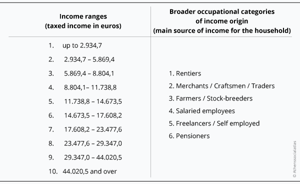
The quantitative data used for our statistical analysis was drawn from the General Secretariat of Information Systems (GSIS) of the Ministry of Finance. It is based on tax returns of individuals per postal code and includes: the number of tax returns and declared income (at current values) of predetermined income brackets and broader professional categories. The timespan of the available data includes the time period between 2003 and 2013.
Table 1:
At this point, four important observations should be made regarding data reliability and the validation of the explanatory power of the analysis. Recording reported income may not represent the levels of prosperity precisely, since it does not represent the (unknown) size of the shadow economy and tax evasion.
- Even if one tried to depict the size of the shadow economy at a national level, it would be impossible to define the level of its spatial heterogeneity at a local level.
- Over time, as shown below, declared income has significantly fluctuated -especially for certain professions- mainly due to changes in taxation (e.g. change of presumed income criteria, taxpayer obligation to submit a tax declaration form if they own real estate, even if they have zero income etc.). This resulted in abrupt fluctuations in the declared income distribution and changes in the calculation of average incomes.
- The use of fixed income brackets at current values can pose problems in long-term comparisons of income inequality, especially in times of intense economic change.
The study area covers the entire region of Attica and includes 508 entries corresponding to postal sectors, out of which 289 are spatially identifiable. The remaining entries refer to Post Office Boxes and Post Offices and therefore cannot be geographically located.
General overview
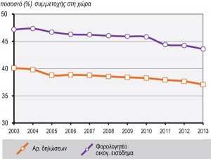
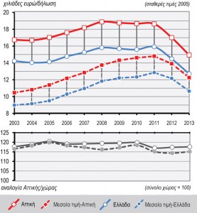
The Attica region accounts for over 42% of the reported income of individuals in the country, though with a steadily declining share for the period 2003-2013 (Figure 1). Accordingly, the average declared income (declared income divided by the number of tax returns) is constantly above 115% of the national average throughout the entire period. The development of total declared income both at country level and within Attica can roughly be broken down into three sub-periods (Figure 2.1 and 2.2):
a) Between 2003 and 2008 there was a steady upward trend that culminated in 2008 (18,900 per capita) and is linked to the general economic climate of the period.
b) Between 2008-2010 there was relative stagnation (for high income levels), which seems to not be aligned with the deteriorating socio-economic context, but is probably related to the change in taxation in 2009. Thus, shrinking available income per head was counterbalanced by the enlargement of the fiscal base.
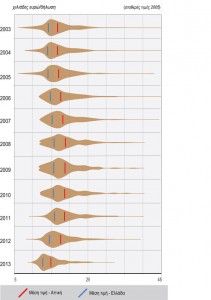
c) From 2011 to 2013, however, the effect of the financial crisis became visible in the tax base too, which shrunk significantly up to 2013. Since then, the average declared income has been less than that of 2003. Average income breakdown is worth mentioning here, as there are significant changes in income distribution: up to 2005, there were extreme maximum and minimum values that affected the reported average income (Figure 2.1 and 2.2).
Figure 1: Participation of the Region of Attica in the total number of tax returns and declared income throughout the country (2003-2013)
Source: GSIS 2004-2014
Figure 2.1: Evolution of declared income in 2005 prices for the Region of Attica and the entire country (2003-2013)
Source: GSIS 2004-2014
Figure 2.2: Breakdown of average declared income in 2005 prices for Attica (2003-2013)
Source: GSIS 2004-2014
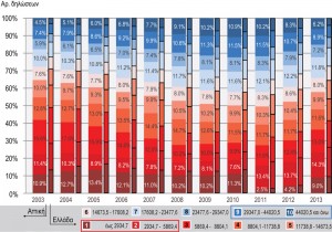
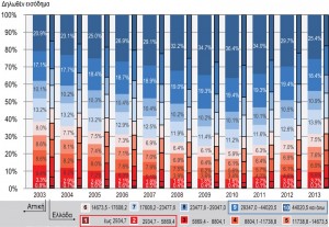
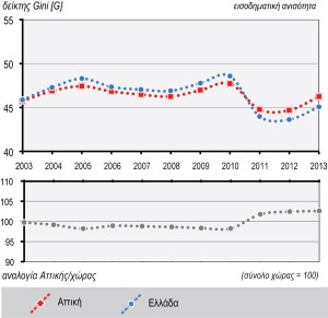
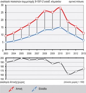
As regards the allocation of tax returns and declared incomes to income brackets in the period 2003-2013 (Figure 3), there has been a gradual increase in the participation of higher income brackets compared to medium-low brackets through 2010. In 2011, this trend reversed, as the lower income bracket shrunk and low-middle brackets expanded, returning to the levels of the previous years. Over time, income inequality, as reflected in the Gini index (Figure 4.1), is associated with the increase in average declared income until 2010, the rapid declared income decline to 2003 levels thereafter and the income stabilisation during 2012-2013. Correspondingly, changes in polarisation (i.e. in the ratio of the two highest income brackets divided by the two lowest income brackets) shows the difference in the rate of change between higher and lower brackets both in the growth period and during the recession (Figure 4.2).
Figure 3: Allocation of tax returns and declared income into 10 income brackets for the Region of Attica and for the entire country (2003-2013)
Source: GSIS 2004-2014
Figure 4.1: Gini index (income inequality) for declared income in the Region of Attica (2003-2013)
Figure 4.2: Relative index of the rate of income inequality (high/low income brackets ratio) for declared incomes in the Region of Attica (2003-2013)
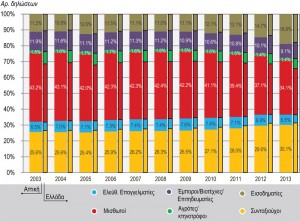
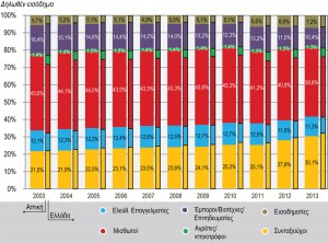
As regards the distribution in broader occupational categories, the main observations can be summarised in the following points (Figure 5.1): Salaried and Pensioners are the dominant source of taxable income. The widening of the tax base in the past three years corresponds to a slight increase in the participation of the Rentiers category in tax returns, however without a proportional increase in declared incomes. On the contrary, the weight of the Pensioners’ category gradually increased as of 2003 (tax return and income share). This also indicates structural unemployment problems both in Greece and in Attica in particular.
The percentage of declared income for Merchants/Artisans/Traders and Liberalss, who theoretically constitute the upper part of the socio-economic scale, remained stable . However, their contribution in tax revenue declined as a percentage of the total. All professional groups in Attica are clearly above the national average with respect to their average declared income. Reductions in income “shifted” after 2010, the year of the most significant cuts in wages and pensions, although the categories of Merchants/Artisans/Traders and Liberals seem to be affected more by the economic crisis (Figure 5.2).
Figure 5.1: Distribution of tax returns and declared income into broader income brackets for the Region of Attica and the entire country (2003-2013)
Source: GSIS 2004-2014
Figure 5.2: Average declared income of broader income brackets in 2005 prices for the Region of Attica and the entire country (2003-2013)
Source: GSIS 2004-2014
Spatial Inequality
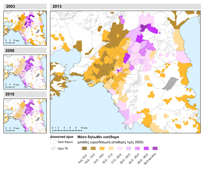
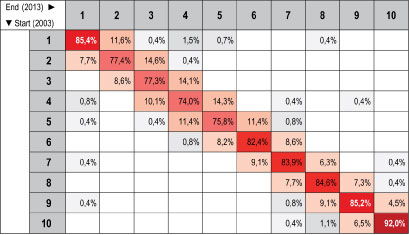
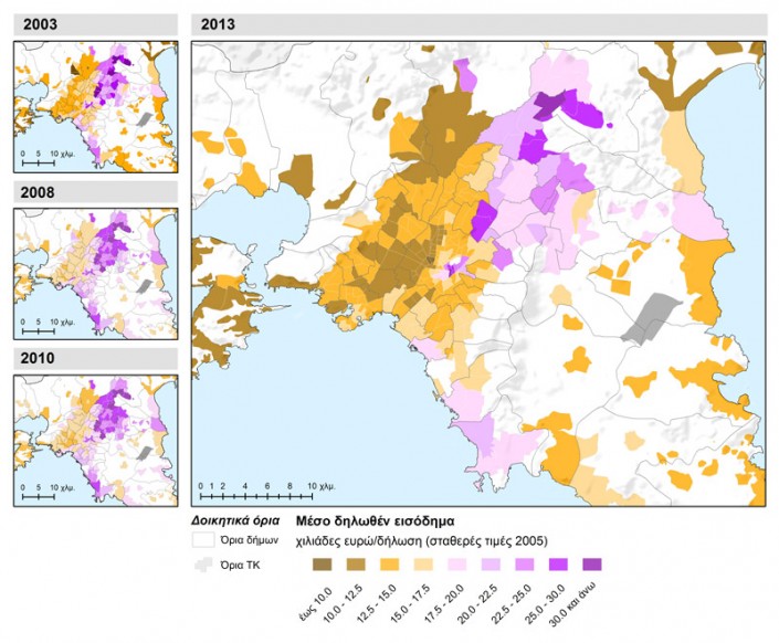
Mapping declared income in the broader metropolitan area of Athens for the year 2013 shows distinct patterns of high and low income concentrations (Map 1.1). For comparison purposes, we have used smaller size representations for the years 2003, 2008, 2010. Previous studies (Μαλούτας 2001; Καλογήρου2011) have evidenced the east-west residential division , which our analysis also shows, together with a division between centre and periphery with local differentiations between north-south, particularly in the eastern part of Attica. More specifically, higher declared incomes are concentrated in the north-eastern part of the metropolitan agglomeration (Erithrea, Ekali, Nea Pendeli, Vrilissia), in the centre of the Municipality of Athens in areas around Lycabettus (Kolonaki, Mavili Square, Evangelismos), in the southern part (Voula, Vouliagmeni) and in an enclave that includes Psychiko and some zones of the Municipality of Filothei. Lower incomes cluster in the western part of the Municipality of Athens, in particular the area of Metaxourgio, a number of zones in the Municipality of Agios Ioannis Rendis and Tavros as well as parts of the north-western zone comprising Aspropyrgos, Fyli, Acharnes and Kamatero.. There is limited “mobility” of the spatial analysis units in the income hierarchy. Areas at the upper end of the distribution have a very high probability to stay there or move upward, while low-medium areas are likely to “move” either higher or lower (Table 2.1).
Map 1.1: Average reported income by Postal Code in the Athens metropolitan area for the years 2003, 2008, 2010 and 2013
Table 2.1: Probability of transition from the initial to the final distribution by deciles for reported average incomes inAthens metropolitan area, 2003-2013
| To examine the “mobility” of a system, we use the Markov chain statistical method, which examines the possibility of variations in the distribution of values from a specific (initial) state to a final state through a transition route with discrete steps. The (hypothetical) probability of a system’s distribution in the next step (and basically in all future steps) depends exclusively on the current state of the system and is not aggregated based on the state of the system in previous steps.
In this particular case, the spatial distribution of the average declared income is considered to be a “system”, while the distribution of declared income into income brackets is the “condition”. Finally, annual recordings of the variable’s values are considered as the “steps”. For the purpose of this presentation, we used a statistical method that takes into account neighbouring values for each spatial unit (Rey 2001). Thus, the double entry table created also represents the probability of a value “moving” from one income bracket to any other, from the base year to the final year of the period reviewed. The values in the cells on the diagonal of the transition matrix describe the probability of an area to remain in the same income bracket from the beginning to the end of the period. High values indicate stagnation in the spatio-temporal dynamic of the distribution of declared incomes. Values in the upper part of the matrix (defined by the diagonal) indicate movement towards a relatively lower income level and values in the lower part of the matrix indicate movement towards a higher level of income. |
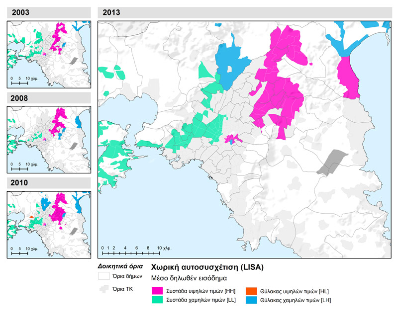
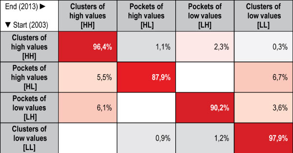
Spatial inequalities in the distribution of income in Athens are statistically documented through the analysis of spatial autocorrelation, i.e. by examining neighbouring areas with similar values. The high values of Moran’s I, the overall autocorrelation index, (above 0.5 in a 0-1 range) suggest significant spatial concentration trends. Over time, the spatial income segregation patterns remain virtually unchanged. A significant observation is the gradual polarisation of urban space with expanding high values in the North-Eastern part and the centre of the metropolis. Similarly, less compact but equally expanding low concentrations are recorded in the western part of the central zone and the western part of the Region of Attica. Low income enclaves have been recorded in the northern part (Acharnes, Marathon). However, given the downward convergence of low-middle income zones, they tend to shrink over time (Map 1.2). Overall, the spatial patterns of income separation are rather inert (Table 2.2).
Map 1.2: Clusters and enclaves of high and low average declared incomes in the metropolitan area of Athens (2003, 2008, 2010 and 2013)
| Spatial autocorrelation refers to the degree of correlation between pairs of a variable’s values and the (spatial) distance between them. The rationale behind this approach is based on the comparison between the value -the variable to be examined- of each territorial unit with a distribution of the values of neighbouring spatial units.
Positive autocorrelation, which is the most common case, suggests that similar/equal values of the examined variable tend to cluster in space. Values may concentrate in the upper end {high value cluster [HH- (High-High)]} or in the lower end of the distribution {low value cluster [LL- (Low- Low)]}. A negative autocorrelation indicates the proximity of spatial units with similar or dissimilar values. This either results in individual spatial units with high values within broader zones with low values {high value pocket [HL- (High-Low)}, or in spatial units with relatively low values enclosed by areas with high values {low price pocket [LH- (low-high)}. Finally, the lack of spatial autocorrelation signifies that there is no apparent relation between spatial proximity and the distribution of the variable’s values. |
Table 2.2: Probabilities of transition from the initial to the final distribution by spatial concentration of the reported average incomes. Athens metropolitan area, 2003-2013
| The interpretation of Table 1.2 can be found in the comments for Table 1.1. The Markov chain method focuses on investigating the dynamics of the distribution of declared income based on the concentration or dispersion of values in space. The cells defining the diagonal of the transition matrix describe the probability of an area to remain in the same income bracket compared to its neighbours from the beginning and to the end of the period. High values indicate the probability of an area to remain in the same spatial pattern as determined by the analysis of spatial autocorrelation (Chart 1.2). Values in cells outside the table’s diagonal illustrate the probability of a spatial unit to “move” to a distribution with a different “relationship” to the neighbouring units. |
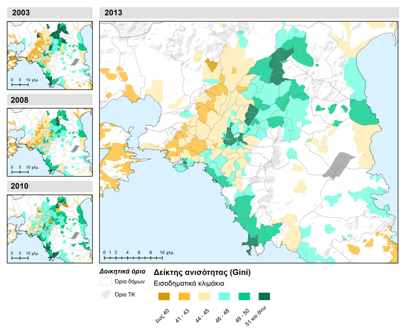
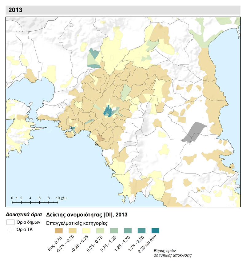
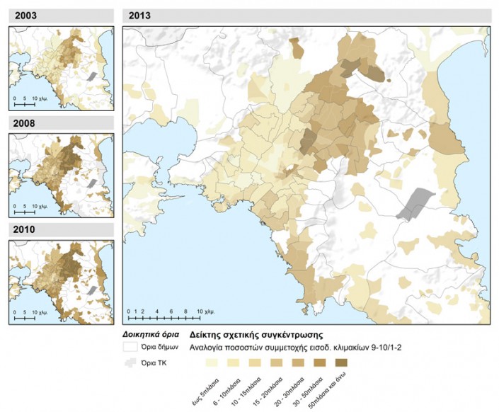
Income inequality is locally reflected by the Gini index for each territorial unit (Map 2.1). The form of the dispersion of index values in space largely follows the geographical distribution pattern of declared income and confirms the strong correlation between inequality (income concentration in small social groups) and income levels, especially in the middle and upper income areas. The absence of tax returns from individuals in high income brackets in sparsely populated and rural areas contributes to the low levels of inequality in those areas. The conclusions from the analysis of the relative concentration ratio (Map 2.2) point to the same direction. Here, we have highlighted income concentration in higher income brackets and their presence in relation to low income brackets.
Map 2.1: The local Gini index (unequal distribution of income) of the average declared income of spatial units (postal codes) in the metropolitan area of Athens (2003, 2008, 2010 and 2013)
Map 2.2: Relative concentration ratio (income ratio in top and bottom income brackets) of spatial units in the metropolitan area of Athens (2003, 2008, 2010 and 2013)
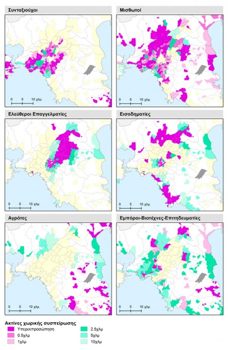
In order to illustrate the concentration patterns of professional categories, we applied an alternative method to determine the extent to which a category is overrepresented in a spatial unit compared to the entire area of study as well as in extended neighbourhood areas (Map 3.1). The Pensioners‘ category displays high participation rates in the central part of the city as well as in Salamina and Lavrio, which is obviously linked to the demographic structure of the population in these parts of the Region of Attica. Employees -the largest category- dominate in most spatial units. In spatial terms this translates into an expanded ring around the Municipality of Athens which expands into the north and north-western parts of the agglomeration. On the contrary, the category of Liberals forms a compact and clearly defined cluster in the centre and the north-eastern part of the urban agglomeration, with rings of relatively higher concentration around it. As far as Rentiers are concerned, there are clear but small clusters of heterogeneous social composition, with large participation rates in both the northern and southern part, as well as in “posh” areas of the centre. The Farmers category is located, as expected, in areas of low urban density. The central zone presents the greatest diversity in terms of professional composition (Map 3.2), while areas with high homogeneity (absence of many categories) are associated to the level of declared income.
Map 3.1: Distribution of broader professional category of the main household income source in successive neighbouring zones , Athens metropolitan area (2013)
| Areas where certain population categories are overrepresented are those whose percentage exceeds two standard deviations from the average of the spatial unit of analysis (Deurloo and Musterd, 2001). Standard deviation is calculated using a binomial distribution given that two factors are involved: the tax returns of one professional category and other tax returns. The formula implemented is:
ΤΑ= √(p*q/n) Where: p, is the rate of the group under review in the area of study, q = 1 – p, is the percentage of other categories in the area of study and n is the mean population in the category under review for each spatial unit. We also examined the probability of different population categories concentrating in extended zones resulting from successive radii of proximity control. We have recalculated the rates of population categories in expanded zones and mapped the cases exceeding the threshold of two standard deviations from the average of the category in question. This method results in different allocation patterns, determined by the composition of neighbouring spatial units depending on the radius of proximity control. Over-representation in different radii indicates the homogeneity degree of value distributions in the category under review. Map 3.1 can be interpreted as follows:
|
Map 3.2: Broader professional categories of the main household income source in successive neighbouring zones of spatial analysis units, Athens metropolitan area (2013)
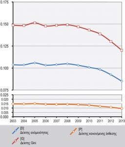
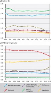
Spatial dynamics, in broader professional categories, as determined by the development of composite (multiple group) separation indices over time (Reardon et al., 2008), show a clear downward trend in all dividers (Figure 6.1). This indicates that there are slow processes of spatial redistribution and population dispersion for the professional categories in the examined spatial units. This suggests that spatial polarisation and homogenisation is mitigated at a local level, particularly for highly populated categories. More particularly, spatial inequality (Gini index) is relatively low, as only 12-15% of the population should be redistributed to achieve full and equal distribution. Similarly, the dissimilarity index (D) expressing spatial polarisation in the from of small group concentration, displays a decelerating trend in recent years. This suggests significant changes are taking place in the composition of spatial units, as populations move from heterogeneous regions to more homogeneous. In terms of professional categories (Figure 6.2), relatively stable and high levels of unequal distribution (Gini index) have been identified in the categories of Farmers/Breeders and Freelancers, while for other categories, index values are significantly lower with a tendency for further reduction. The relative isolation of individual categories appears to be decreasing over time and Employees are leading this trend. To a certain degree, this indicates a withdrawal of the remaining less populated categories from specific, over-represented areas.
Figure 6.1: Multi-group division indices of broader professional categories of the main income source, Athens metropolitan area, 2003-2013
Figure 6.2: Multi-group division indices of broader professional categories of the main income source, Athens metropolitan area, 2003-2013
| Measuring socio-professional group divisions
To present a comprehensive picture of long-term division patterns, we selected three synthetic indices using general occupational category data: the dissimilarity index (D) outlines spatial concentration levels, the normalised exposure index (P) calculates exposure/isolation levels and the Gini index calculates unequal spatial distribution as well as concentration. Dissimilarity index (D) D values range from 0-1 where 0 signifies lack of segregation (all spatial units are mixed and present the same rates throughout the study area) and 1 represents absolute separation (zero mixing in all spatial units). The index can be interpreted as the percentage of group A (e.g. immigrants), which ought to change place of residence in order to be distributed in space in the same way as control group B (e.g. the total population). Gini index This index is used to measure income inequality in terms of spatial partitions. The Gini coefficient ranges from 0 (perfect equality) to 1 (maximum inequality). However, its use is also possible for population division analysis. In the case of a city, the index value describes deviations in the distribution of population groups in areas different from their distribution throughout the entire city. Normalised exposure/isolation Index (P *) Isolation and exposure indicators measure the likelihood of a member of a group to interact with other members of the same group or with members of other groups. The isolation index values range between 0 and 1, indicating zero and complete division respectively. When the isolation index (xPx) examines one population group exclusively and calculates the likelihood of intergroup contact, i.e. the average probability of interaction (exposure) among the members of the same group and hence isolation from members of other categories, in all spatial units of the study area. |
Conclusions
To conclude, in recent years, income inequality has remained stable and at lower levels compared to the period of growth -following a period of steady increase up to 2010. This is the driving force in the reduction of income segregation especially for middle income brackets, which currently converge at lower levels. The spatial inequality based on income, on the other hand, is an integral part of the profile of Athenian space. However, its intensity is obviously related to the evolution of income inequality. Over time high income areas become “entrenched”, while middle classes “depart” and “integrate” in areas lower income areas. Low income brackets do not appear to face isolation. For the time being, this is an indication of relative absence of poverty enclaves in the urban space.
Entry citation
Pantazis, P., Psycharis, Y. (2016) Residential segregation based on taxable income in the metropolitan area of Athens, in Maloutas T., Spyrellis S. (eds) Athens Social Atlas. Digital compendium of texts and visual material. URL: https://www.athenssocialatlas.gr/en/article/income-groups/ , DOI: 10.17902/20971.58
Atlas citation
Maloutas T., Spyrellis S. (eds) (2015) Athens Social Atlas. Digital compendium of texts and visual material. URL: https://www.athenssocialatlas.gr/en/ , DOI: 10.17902/20971.9
References
- Καλογήρου Σ (2011) Χωρικές ανισότητες και ερµηνευτικοί παράγοντες της γεωγραφικής κατανομής του δηλωθέντος εισοδήματος στην Ελλάδα. Αειχώρος 15: 68–101. Available from: http://www.aeihoros.gr/article/el/xorikes-anisotites-kai-ermineutikoi-paragontes-tis-geografikis-katanomis-tou-dilothentos-eisodimatos-stin-ellada.
- Μαλούτας Θ (2002) Η κοινωνική μορφολογία των πόλεων. Στο: Μαλούτας Θ (επιμ.), Κοινωνικός και Οικονομικός Άτλας της Ελλάδας. Οι πόλεις, Αθήνα, Βόλος: Εθνικό Κέντρο Κοινωνικών Ερευνών, Gutenberg, Γιώργος & Κώστας Δαρδανός, Πανεπιστημιακές Εκδόσεις Θεσσαλίας.
- Deurloo R and Musterd S (2001) Residential profiles of Surinamese and Moroccans in Amsterdam. Urban Studies, SAGE Publications 38(3): 467–485.
- Reardon SF, Matthews SA, O’Sullivan D, et al. (2008) The geographic scale of metropolitan racial segregation. Demography, Springer 45(3): 489–514.
- Rey SJ (2001) Spatial empirics for economic growth and convergence. Geographical Analysis, Wiley Online Library 33(3): 195–214.

